Turning Geographic References into Maps with Recogito: Part 1(of 2)

By Caroline Diemer

Note: This is the sixth in a series devoted to the project “Narrative and Geography in the Chronicle of Theophanes the Confessor”.
First post (“place” in history) here; second (“place” in narrative) here; third (how we divided our text) here; fourth (how we coded “geography” in our text) here; fifth (how we organized those codes) here

This blog post will follow very closely the “geographic references” that we have implemented in MaxQDA (as discussed in the previous blog post).

With the easily accessible, incredibly detailed and accurate maps constantly available to us in our daily lives, we must always keep in mind that we do not have the same mental visualizations of the physical world as would those we study in the past (for this project specifically, ninth-century Byzantines).

When reading such geographic reference-rich texts as the Chronographia, it is hard to understand the world that is being constructed for the contemporary (ninth-century) reader. This is due in part to the disjunct created by our own reliance on visualizing the world as maps, but also to our unfamiliarity with the names and connotations specific places would have had for a ninth-century Constantinopolitan.

Our tool of choice: Recogito

To understand the geography of the Chronographia, we are using Recogito, a program which visualizes, or actualizes, written geographies that can cause the modern reader confusion. Why was Recogito the right source for our purposes?

Recogito is an initiative of the Pelagios commons, a text annotation tool for creating maps by turning “tags” of geographic references in a text into either points or polygons (the program’s way of representing a region) on a geographic projection.

The placement of the points, as well as the shape of the polygons, come from Pelagios Map Tiles. Recogito collects its place data from the community-built and rigorously edited online gazetteer Pleiades, as well as the Digital Atlas of the Roman Empire (DARE). As such it not only has the virtues of being online and open access, but is also backed up by the most up-to-date and rigorous geography of the ancient and late antique world available.

Recogito works to put texts in direct conversation with all of this geographic data.

For instance, Recogito has a function for tagging/annotating all references in a text. For example, when I tag Constantinople, I am given the opportunity to tag all the mentions of Constantinople in the text I am working with.

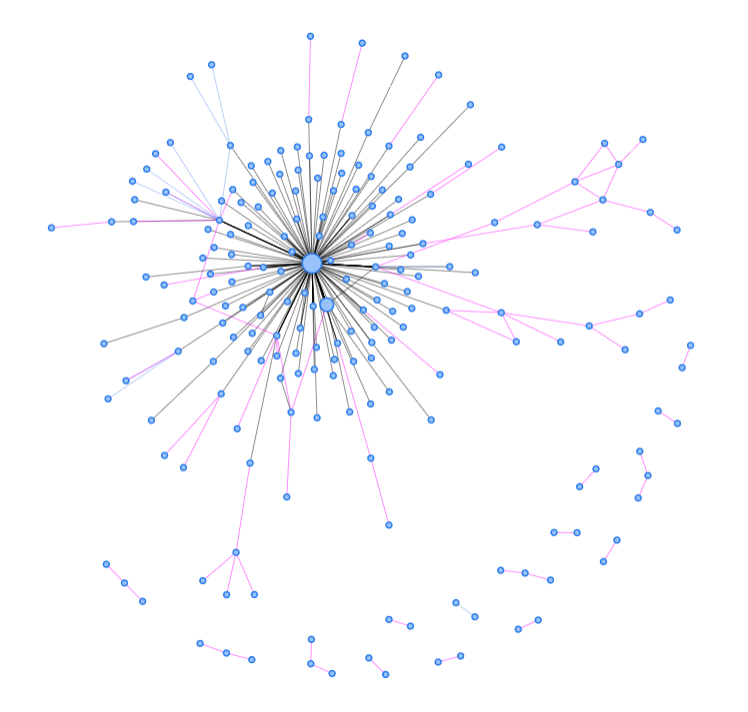
After I have finished my tagging, Recogito will generate a map that represents points as circles. A point with many tags will be larger than a point with very few (though there is a small standard size, so depending on the range of the distribution of points, points with a few tags may be the same size as one with only 1 tag).

When you click on one of these circles (or “points”) Recogito shows you all the different terms from the text that we have located at that geographic point. This is especially important for our project as this feature allows us to see who is mentioned in association with a specific place. That is, many of our geographic tags are what we have called “implicit geography” – such as bishops who are tagged with the city of their see.

Clicking on a point also displays a portion of the specific passage that point comes from (and if multiple passages, how many), as well as the number of tags for a place.

Both of these features help to show what has determined the nature of the site’s role for this section of the text. Such as: Is Alexandria, as a city, mentioned a lot or are there a lot of people from Alexandria doing things?

The Process

  1. Splitting up the Chronographia into the different emperors

We split up the Chronographia into individual text documents for the reigns of each emperor. We did this first because it is an extremely long document.

But second (and most important for our analytical questions), dividing by emperor allows us to compare the differences between emperors. We are interested in seeing what types of geographies appeared with each emperor. Where are the geographies of concern? Is there one place mentioned more than the others? Is each particular reign more region-based or city-based (as we found when comparing Diocletian to Constantine)? What people groups or regions did the Chronographia consider to be of greatest concern under each emperor?

  1. Uploading the Documents, and Recogito’s self tagging

Recogito has a feature whereby, when you upload a document to the program you can allow it to automatically tag any place it can recognize. In theory this would be an incredibly helpful feature, considering about 25% of the things I tag in Recogito are well-known places. As already stated, Recogito draws place-names from several platforms, not just from Pelagios map tiles, but DARE (Digital Atlas of the Roman empire) and Modern Geonames. It seems that with the automatic tagging feature, however, Recogito currently does not use Pelagios and DARE but only Geonames, or at least prioritizes this database. This is a problem because there are many places around the world which share names. One example of this is Antioch. Syrian Antioch is an often mentioned city in Recogito because it is one of the bishops that is included in the rubrics. But instead of tagging ancient Antioch, Recogito automatically tags the Antioch in southern California, half a world away from where we needed it.

This is what happens when Recogito autotags all of the Chronographia

This problem arose with the majority of the automatic tags. Because Recogito does not have any way to mass edit tags, I would have to go through and fix each tag individually. So instead of letting Recogito try to automatically tag places for us, we had to start with a clean slate. This required us to unclick the automatic annotation button during the uploading process.

  1. With and Without Rubrics comparison

Besides comparing the narratives of different emperors’ reigns to each other within the Chronographia, we are also ultimately interested in comparing two versions of the Chronographia. The main difference between the “geography” of the two versions of the text is quite significant, more so than one would guess as the bulk of the text of the Chronographia is exactly the same in both.

The one version – that which is familiar to historians of Byzantium as the version in all the critical editions and translations – has what we call “dating rubrics,” which are not red-lettered headings, but a list at the beginning of each new entry with the current emperor, the emperor of Persia, and the bishops of Rome, Constantinople, Jerusalem, Alexandria, and then Antioch.

The other version of the Chronographia (preserved in the ninth-century manuscript Paris BnF Grec 1731) lacks this rubricated system of dividing up each entry.

Since our interest is in studying geographical mentions or references in the Chronography, the difference between these two is significant as the one version initiates each entry with this “dating rubric” rote-mentioning seven places, whereas the other version has none of these.

Thus far, all of the Chronographia with rubrics has been mapped in Recogito. A selected number without rubrics has also been mapped. At this mid-way stage of our project, comparing the two versions allows us to already see exactly what a difference these references make in the geographic “pictures” created in the two versions of the text. The difference is immediately apparent, and quite visually striking:

The Geography of the Reign of Constantine I according to the Chronographia (305-335):
(left) with dating rubrics, (right) without dating rubrics

This is, however, preliminary and is merely a preview of some of the analyses we will use Recogito to perform on the narrative of the Chronographia.

In our second post on Recogito, we will describe some of the procedures and problem solving techniques we have developed in order to use this tool to map our text in a manner aligned with our research questions and agendas.

Lab Meeting: December 7, 2017

A busy Fall Semester for the Traveler’s Lab ended with a group meeting on Thursday December 7.

Fourteen Wesleyan students joined Profs. Birkett (Exeter, UK), Franklin-Lyons (Marlboro), Koscak (Wake Forest), Oleinikov (Wesleyan), Shaw (Wesleyan), Torgerson (Wesleyan). We were also joined, via video-conference, by our potential collaborators at Laffayette College, Prof. R. Goshgarian, Dr. J. Simms, and J. Clark.

We heard presentations on:

We can now also announce our visiting colleague, Prof. Stephanie Koscak’s project for Spring 2018: Lost and Stolen Objects in 18th-century London. Next semester at Wesleyan and Marlboro will also see continued work on the Chronicle of Theophanes, the Datini Archive, the Friars’ settlements, and turning more itineraries into roads in Late Medieval England.

Finally, we bid a “see you soon” to our collaborator Prof. Helen Birkett who will be returning to Exeter University after a semester of working with the Traveler’s Lab. We look forward to turning this semester’s work into a consistent shared workflow and further tangible collaborations as Prof. Birkett pioneers the Traveler’s Lab “Network.”

Some images from the presentations:

Still in process, here is the “communication network” generated thus far from Caesarius of Heisterbach’s Dialogus (or Exempla)

After 18 months of data generation, the very first bits of data analysis from the Chronicle of Theophanes:

Mapping the Communication Network of the Datini Company

[This project had significant technical assistance from Pavel Oleinikov at Wesleyan University and Logan Davis, Marlboro class of 2017.]

I have been working with the Datini metadata and letter collection for about a year, but have had more ideas and questions rather than actual analyses and observations.  Just this semester, often in discussions with students I have started to hit on productive lines of analysis within the data.  At the Social Science History Association’s annual meeting in Montreal (Nov. 2-5, 2017), I presented a few preliminary observations – the charts and notes below are all taken from the talk.  First off, if you are not familiar with the Datini company’s letters, the project description includes a short introduction with a number of links to the archive itself and some further readings.

What is a “Normal” Travel Time?

One of the persistent difficulties with medieval travel and communication derives from the fact that baselines are very hard to create.  “Normal” travel, even along short distances, was highly irregular.  Moderate trips could take days or weeks depending on weather, brigands, political difficulties, or any number of other delays.  In Fernand Braudel’s The Mediterranean, he described this as a continuing feature even after 1500: “The essential point to note here is this very variety, the wide range of times taken to travel the same journey: it is a structural feature of the century.” (Braudel, 360).  One of the best advantages of the large body of letters in the Datini collection is that it allows for broad generalizations about travel time and what we might count as “normal” communication.

Attempting to create a sense of average travel times, I selected a series of city pairs that have a relatively high volume of communication – generally at least 500 letters.  This allowed for the errors and vicissitudes present in the data (letters with impossible travel times – both too short and too long, negative travel times, journeys that were simply unexpected, etc.) to be outweighed by useful data, making generalizations possible.  I first noticed that the graphs of travel times between cities tended to have either a relatively tight set of times with a clear center or a messier, more irregular set of times.  The graphs below are two good examples of each type: the trip between Barcelona and Valencia (≈350km), in which the vast majority of trips took six or seven days; some took five or eight, but many of the trips that fell outside this narrow window probably involved some form of delay or even an error in documentation.  On the other hand, the trip between Palma de Mallorca and Florence had large numbers of letters taking anywhere from thirty to forty-five days.  The trip was somewhat longer (≈1000km), but significantly less reliable.

Measuring Reliability with Standard Deviation

My first thought was that this might simply be a product of distance.  To test this, I needed a generalized measure of multiple comparable trips.  Using the standard deviation gave a rough number of days within which the majority of the trips occurred: a higher standard deviation means a less reliable journey (for the above examples, Barcelona/Valencia has a standard deviation of just over 4, Palma/Florence is over 12 – so far so good).  I then produced a map of all of the high-frequency travel routes (this came out to roughly a dozen examples with 500-1000 letters, another dozen from 1000-2000 and a final dozen from 2000-5000).  I color coded the routes by high, medium, and low reliability (green is a standard deviation under 5, blue is 5-10, red is over 10.)

While distance seems to play a role, the larger distinction appears to be between land and sea routes: land routes are on the whole more reliable and present much less variability (a lower standard deviation) than any route which required a ship.  In some respects, this is difficult to measure, because many journeys (Valencia to Marseille, Pisa to Genoa, etc.) could be accomplished either on ship or on land.  However, it is quite notable that trips that require a ship (all communication with Palma de Mallorca, for example) routinely have a higher standard deviation than equivalent or even longer-distance trips accomplished on land.  This map also confirms one of Federigo Melis’s own earlier arguments: that Datini’s representatives largely separated the sending of information from the sending of goods.  Even the long trip from Bruges to Barcelona happened almost entirely over land, meaning the information the couriers carried was worth the cost of a completely separate trip unconnected to the Italian galleys routinely sent around Spain to the low countries and England for wool.

Graphing Specific Travel Routes

To get a better sense of what the standard deviation was telling me about these various trips, I chose a representative set of cities to graph all of their trips over time – a more granular visualization than the full map.  This would indicate both if there was any change in the speed and method of travel over time, but also provide a different way to visualize the reliability of land travel.  The following three graphs show the travel times of all known letters sent from Barcelona to Valencia, from Bruges to Barcelona, and from Palma de Mallorca to Florence.


Previous research has already confirmed that Barcelona to Valencia is certainly land based: it is fast, highly consistent, and has a strong “floor” to the speed, meaning that most trips not only happened quickly, but that the trips took close to the minimum possible amount of time.  Palma to Florence – necessarily a sea trip – has no clear floor and only a hazy average time.  No two sea trips are alike and the average is a good bit higher than the possible fastest trips.  Finally, the graph of travel from Bruges to Barcelona cements the clear impression that most communication came by land.  The graph has a strong floor with a fairly narrow band of travel times, similar to the shape of the Barcelona toValencia graph.  The graphs also indicate that the travel times of each journey stayed relatively consistent over the (relatively short – 1370-1415) time period of the Datini letters – so nothing notable to report there.

And finally: Speed…sort of

The last visualization I created attempts to get a sense of speed along these many routes.  Measuring time is straight forward enough: I used the median travel time for each route.  Distance, however, is an entirely different problem.  For land routes: did people travel the shortest distance all the time?  Surely they did not travel as the crow flies.  Did they travel more likely through known cities even if the route was longer?  Were there portions of river travel interspersed with travel on foot?  For trips in the Mediterranean: it is impossible to know if they followed the coastline or sailed across open seas.  Did the ship stop at any intermediary ports to take on supplies?  Did this add two or three days to the trip that could change our estimation of the speed of travel?  Difficulties abound – most of which medievalists are quite aware of.

Despite these questions, I estimated rough distances between all of the cities, taking into consideration whether I thought the trip was on foot or on ship (in part derived from the standard deviation score compared with the distance.)  The results demonstrate that travelers on foot were not only more reliable, but generally faster than messages sent on ship.  While there are surely extraordinary voyages where a ship manages a very high speed, in the aggregate of thousands of journeys they are routinely slower than land based travel.  Additionally, even across long distances (again, note Bruges to Barcelona), the travel times imply a fast clip (40km+ per day) over many days.  There are a few outliers on the map likely caused by two cities at a distance apart that represents a tipping point.  ie: if location A is 50 kilometers from location B, it’s highly possible that many letters are recorded as taking two days – a speed of 25 kilometers per day (quite slow.)  However, it is just as likely that the courier traveled at 40 kilometers per day and arrived early on the morning of the second day – a fact which is almost never recorded in the documents.  These problems get smoothed out at longer distances, so the outliers tend to be on short routes.

Moving Forward

The most notable commentary to come from the conference is that I neglected to investigate the role of seasonality – Mediterranean shipping is notoriously seasonal because of prevailing winds and winter storms.  The data initially suggests there is less seasonality than expected, but I do not have very solid analyses yet.  A couple of brief looks at the data suggest that the different travel in summer and winter did not influence land-based travel, but did slow down ocean going travel.  A further question follows from the seasonality question: if ship travel slowed down significantly in the winter, did this influence the number of letters sent in winter?  Did certain routes that could use either ships or land lean towards land in the winter in response to harder ocean crossings?  If we split the summer and winter trips of an ocean going voyage apart and graph them separately, do two clearer time bands emerge?

Beyond this specific question, there are a couple other ways to move forward.  The first is to figure out a better way to model and illustrate or visualize the structure of the datini communication.  This will probably involve breaking the usual planimetric accuracy of many thematic maps and creating some form of topological map (think the London Tube map) or cartogram that makes routes more important than the angles and structures of the coastline.  And second, I hope to more thoroughly review Melis’ work on communication in the Datini company and begin to get a sense of who was actually doing the work of moving information around – a prosopography of messengers, if you will.  The mercantile communication of the Datini company will make a compelling comparison to the urban and royal communication systems (which are much less studied than Datini) that make up the “Couriers in the Crown of Aragon” project at the Travelers Lab.

Exploring Institutional Structures and Individual Networks

by Helen Birkett

I’ve been in residence at the Traveler’s Lab this semester and have taken the opportunity to work with Wesleyan students to extend my study of Caesarius of Heisterbach’s social network. The results, so far, are promising…

Background

My project uses the Dialogue on Miracles by Caesarius of Heisterbach (c.1180-c.1240) as a case study for investigating the structure of Cistercian social networks c.1200. Caesarius was a monk at the Cistercian abbey of Heisterbach in Germany and my project examines the social interactions recorded in his most famous work, the Dialogue on Miracles, which was written in the late 1210s and early 1220s. I started this project as a way of exploring the possibilities of network analysis and to test out a hypothesis that underlay my work on interactions between Cistercians in Britain at around the same time.

The Cistercian order developed a particularly extensive and regular system of communication between its abbeys. This was partly the result of the way in which the order expanded: new houses were founded by a group of monks setting out from one community, the mother house, to begin another, a daughter house. This meant that the Cistercian order was structured like a family tree in which each community could trace its relationship back to Cîteaux, the founding house, through lines of filiation. Importantly, the Cistercians used these relationships to maintain discipline and uniformity in the order: each year the abbots attended an annual general chapter at Cîteaux; and each year the abbot of a mother house was required to visit each of the abbey’s daughter houses.

My research investigates how this structure functioned as a communication network for the transmission of miracle stories. Although sparse and sporadic, my British source material was already suggesting that this structure was less important in the transmission of stories than I had anticipated. The Dialogue on Miracles, a large work of 746 chapters in 12 books or 805 stories, provided a much bigger dataset with which to test these ideas. It also gave me the chance to compare new digital approaches with the more traditional analytic techniques employed by Brian Patrick McGuire in his classic study of Caesarius’ social network.

Research Questions

I began research on this project a couple of years ago in collaboration with Pádraig Mac Carron, a physicist and network analysis expert at the University of Oxford. The project is based on two main research questions:

  1. How useful is network analysis for understanding the transmission of exempla in the Dialogue on Miracles?
  2. To what extent does Caesarius’ communication network correspond to Cistercian lines of filiation?

The first question is the more explorative, fun one – it really asked, can I use network analysis to look at this material? The initial response to this was… kind of. I created a database of interactions that recorded Caesarius’ sources for his stories, which Pádraig converted into a visualization. However, the resulting ‘network’ was limited and artificial – as might have been expected from the nature of the sample, it was almost entirely based on Caesarius. The addition of the few stories which had a provenance not directly linked to Caesarius (i.e. he doesn’t tell us how he heard them) did little to complicate the picture (these are the red dashed lines below).

Visualization of Caesarius’ sources (Pádraig Mac Carron)

The second question engaged with this data in a more sophisticated way and provided some more promising insights. My research showed that while some of the interactions in Caesarius’ text followed expected lines of filiation, a surprising number of interactions jumped between filiations.

Caesarius at the Lab

My collaboration with the Traveler’s Lab is allowing me to pursue these questions further. Two Lab members, Rachel Chung and Rebecca Greenberg, are working with me to create an extended dataset that records the interactions within the stories themselves. Our aim is to use this new, extended dataset to complicate Caesarius’ network – to use interactions in the more fictionalised narratives of the text to offer a more realistic picture of the Dialogue’s social world (it’s a conceit that appeals strongly to my literary side!). This extended dataset should also offer further insights into the question of Cistercian communication structures vs social reality.

This new dataset includes only direct interactions between identifiable individuals. This means it excludes implied relationships (such as familial relationships) unless the two individuals talk, write to each other, or interact directly in some way. This does create an element of artificiality in the data, but it also means we focus on who is actually talking to whom rather than expected interactions. We’re also only listing identifiable individuals to make sure that we can merge these datasets and networks successfully. As a result, I’ve had to refine my original dataset for Caesarius’ sources, which included a lot of anonymous individuals and the potential for double-counting.

Visualization of interactions within the Dialogue of Miracles (Elizaveta Kravchenko)

Currently, we are a third of the way through the data and the results are promising. This visualization, produced by another Lab member, Liza Kravchenko, shows the integrated networks of Caesarius’ sources (black), the additional external sources for his stories (blue), and the interactions within the stories themselves (pink). The nature of the material means that Caesarius will always dominate this network, but this visualization suggests that something more complex and realistic is starting to emerge.

Further Research

As usual, creating one dataset prompts you to think about creating another to offer a fuller or slightly different analysis of the material. Here it’s become clear that a dataset of family networks within the text would be a useful way of investigating individual and institutional connections, and something that should be integrated into the social network of the Dialogue. We could also extend our dataset to include interactions with divine beings, although I remain unconvinced of the value of doing this. Finally, my attendance at the Social Science History Association Conference in Montreal last weekend drew my attention to other ways of visualising textual data, which might be used to make simple, but effective points, about the geographical or thematic biases of my material. These visualizations were based on qualitative data analysis (QDA), which is pretty easy if you have clear search terms but, if not, will be a much more labour-intensive process – and I need to give more thought as to whether the effort involved here is really worth the result.

Traveler’s Lab papers from SSHA (Montreal): Lab Meeting Nov 9, 2017

On Thursday November 9, 2017 we resumed our regular meetings in Allbritton 304, 11.50-1.10.

We heard, and then discussed, condensed versions of Prof. Shaw, Birkett, and Franklin-Lyons’ papers from the SSHA conference in Montreal the previous weekend (panel schedule and titles to the right –>).

Celebrating the success and hard work of the lab team that these papers represent — including an update to Prof. Franklin-Lyons’ paper that incorporated seasonality — we discussed connections between the projects’ methods and conclusions, and we considered new objectives, questions, and methods for moving forward with each.

(below) Prof. Shaw demonstrates the surprisingly consistent centrality of Franciscan, Augustinian, and Austin annual meeting locations.


SSHA in Montreal: November 5

The Traveler’s Lab hosted its own panel — “Mapping Communication in Late Medieval Europe” — as part of the Historical Geography and GIS strand at the annual meeting of the Social Science History Association conference (held this year in Montreal).

Our papers (below) featured (and credited!) student work done in the Traveler’s Lab over the last several years by student researchers Logan Davis (Marlboro ’17), Stephanie Ling (Wes ’16), Connor Cobb (Wes ’18), Elliott Williams (Wes ’18), Elizaveta Kravchenko (Wes ’19), Rachel Chung (Wes ’18), Rebecca Greenberg (Wes ’19), Ilana Newman (’18), and Maia Reumann-Moore (Wes ’19). We are also all indebted to the ongoing collaborative help from our colleague Prof. Pavel Oleinikov.

In her formal  response to the papers, Ann McCants (MIT, history) expressed the significance of the fact that our model for pursuing rigorous and innovative historical research with undergraduates needs to be pursued and expanded as a model for the field.
Commentators urged us to use our methods to bore down into questions that medieval history has traditionally had a very hard time pursuing, such as non-elite travelers and quantifying the impact of the seasons on movement.
Prof. Shaw’s paper even elicited a live-tweet from Prof. Leo Lucassen, director of the International Institute of Social History at Leiden University.

Above: The Traveler’s Lab team (l-r: Jesse W. Torgerson, Helen Birkett, Gary Shaw, Adam Franklin-Lyons) responds to questions from the audience.

Below:
(left) Adam Franklin-Lyons walks through how he has been able to use the data from the 14/15th-century Datini Archive to establish expected travel times between cities.
(right) Helen Birkett shows how paying careful attention to the transmission of stories in Caesarius of Heisterbach’s 13th-century Dialogue of Miracles is beginning to allow her to see a real social network start to emerge from this collection of narratives.


Photo credit: John Clark (Lafayette College) & J.W. Torgerson

Converting to Github: Any Problems? Lab Meeting October 26, 2017

On October 26, 2017 the Traveler’s Lab met on Wesleyan Campus to walk through the initial stages of converting and migrating our data sharing and storage activities to Github. Led virtually by our own Prof. Adam Franklin-Lyons (Marlboro College), students and professors walked through the various organizational models, and decided on how to structure our “organization,” as well as the various projects that each professor is leading.

To Github or not to Github? Lab Meeting October 17, 2017

On October 17, 2017 the Traveler’s Lab gathered to hear presentations from Elliot Williams (’18) and Elizaveta Kravchenko (’19) on their proposal for the lab to move from and eclectic and individual approach to data storage and shared working files on Google Drive and Dropbox to a single site model on the widely used Github platform.

We were joined by Prof. Stephanie Koscak (Wake Forest University), a visiting faculty fellow for the year at Wesleyan’s Center for the Humanities.

Consider Github. Adobe thinks it works pretty well:

What’s a Network? How “to Database”? Lab Meeting Sept 28, 2017

The Traveler’s Lab met on Wesleyan Campus, September 28 2017 to welcome our new student members, and begin working on defining and transmitting one of the core skill sets we employ: turning a variety of historical sources into databases that represent networks of travel and communication.

Prof. Pavel Oleinikov gave us a presentation entitled “Networks in History,” on the history and theory behind use of network analysis for historical research questions.

Traveler’s Lab students Elizaveta Kravchenko (’19), Brendan McGlone (’18) and Ilana Newman (’18) then gave us working examples of how they have and are turning historical sources into spreadsheets of data.

We were joined by Prof. Christine Axen (Fordam University), in person, and virtually (via Google Hangouts) by a half dozen students of Prof. Kathryn Jasper from Illinois State University.
Prof. Jasper and her students are exploring starting either a satellite of, or their own version of the Traveler’s Lab.

Meeting in action:

Chronography’s Geography: To Organize Geographic References

By Ethan Yaro

Note: This is the fifth in a series devoted to the project “Narrative and Geography in the Chronicle of Theophanes the Confessor”. First post here; second here; third here; fourth here.

The chronicle is geographically dense. After completely coding only half of the text, we have reached over ten thousand data points.

This immense amount of data, unsorted, represents an impenetrable mass, with little meaning for either the casual observer or someone already well versed in the text. For this reason we developed categories into which we could sort this multitude of geographic references.

Learning how to Categorize Our Data

My creation of the Geography in Theophanes database began with an excel sheet. Initially, when developing the excel-sheet index, I created a few general categories in which to sort all of the geographic references or tags. There were only 11, and I initially imagined that this would do a pretty good job organizing the data.

As I moved the project into MAXQDA the number of data points that had been coded in the text steadily climbed into the hundreds and then thousands. It became clear that there had to be a more in-depth organizing principle for all the different types of codes.

Oddly enough, the first step in separating out the different types of data was creating fewer distinct archetypes (or super categories): rather than the initial eleven categories, I boiled the data down to four main types of geographic data within the text. These were:

1: Explicit Geography – References to geographical places, such as Jerusalem, Africa, or Hagia Sofia.
2: Geographical Titles – References to geography that are not a place, but someone associated with a place, such as The Persian Emperor (associated with Persia), The Bishop of Constantinople (associated with Constantinople), or The Dux of Palestine (associated with Palestine).
3: Geographically Related People Groups – References to groups of people that have a distinct geographical association, such as The Citizens of Constantinople (associated with Constantinople), the Bulgars (associated with Bulgaria), and Romans (associated with Rome).
4: Geographically Related Events – References to occurrences that are geographically tied, all of which are synods and councils, such as the Holy Ecumenical Synod of Chalcedon (associated with Chalcedon).

It should be noted that the last three categories of references are all dependent on the existence of the first. Many references in these categoires are also references to the actual geographical place with which they are associated (see our fourth blog post in this series to see how this nesting works).

From these categories I then generated a multitude of different stemma into which I would sort the data.

Making Friends with MaxQDA

Initially, I thought of these four different groupings in terms of ArcGIS. ArcGIS separates geographical data into three different kinds: polygons, lines, and points. Deserts, some bodies of water (lakes, oceans, etc.), continents, and regions were thought of as polygons. Other bodies of water (rivers, streams, etc.) and roads were thought of as lines. Cities, forts, and monasteries were thought of as points.

This way of thinking gave me a problematic structure. Once the number of places within cities grew, it seemed illogical to think of these (place) points as being within (city) points. Cities could have become polygons, but it would have been impossible to plot out such polygons for all cities. This classification scheme was soon was dropped in favor of MaxQDA’s “way of thinking” about the data.

MaxQDA is efficient for sorting and resorting. The code groups one generates are easily movable and can be made subsets of other codes. Often these subset chains are three or four levels deep. For example I made Hagia Sofia a subset of Constantinople, which in turn is a subset of Cities, which is in turn a subset of Explicit Geography.

It should also be noted that, as described in our second post and as demonstrated above, we made the decision to adopt a capacious concept of “geography.” One value of MaxQDA is that it easily allows us to select only particular tags or references. Thus, if we want, we can easily choose to run analysis only for “explicit geography” and suppress references which are more subjectively geographic.

Now, using a portion of the category Explicit Geography as an example, I will follow one of these larger code groups down to its smaller parts to demonstrate how the sorting process works for our project.

Note, for this and all the images that follow, that there are some categories and items which have few or even zero instances. This is due to the fact that these are screen shots of in-process coding, and due to the fact that MaxQDA has some difficulty with the amount of data I am working with, I work with small sections of the text at a time. Items with “0” tags noted are there because they are holdovers from previously-coded sections of the text.

In the above example, “Explicit Geography” has one direct subcode, which is “The World.” “The World” is the largest, most all-encompassing data point of Explicit Geography, and correspondingly, all the other geographical data within Explicit Geography has been made a subset of the world. Within “The World” are the subcodes Deserts, Bodies of Water, Cardinal Regions, Cities, Continents, Forts, Monasteries (that are not in cities, as monasteries in cities become subcodes of the city), Mountains, and Regions.

Unlike “The World,” which not only exists as a category I created, but as a “geographic reference” in the text (i.e., the Chronicle does talk about “The World”), some of these subcodes (such as “Cities”) have no independent tags of their own, and so will also show “0”.

Within all of these are more subcodes. In order not to be tedious, I will only examine one single subset – “Cities” – within “The World.” “Cities” contains good examples of how the smaller subcode structures often work.

As can be seen below, the subcodes within “Cities” are specific cities. These cities are sorted alphabetically (except for Constantinople which, as the axis around which the text revolves, I made accessible to expedite coding within Constantinople).

As indicated by this small selection of the subcodes within cities (many being hapax legomena), we currently have hundreds of distinct cities mentioned by the Chronicle.

Codes within Codes: Constantinople

Let’s look one subcode level lower. I will use Constantinople as the example, since it has the most fleshed out set of subcodes of any city in the text.

While we could sort everything Constantinopolitan together (all could all be conceived of as equivalent points on the map, and sorted as similar data), there are certain subsets within Constantinople which seemed distinct enough to separate from each other.

Separating all items by type allows more comparisons. Furthermore (as we will see in a future post), developing these categories allows us to activate MaxQDAs analytical capabilities. But I did make editorial decisions.

Within “Constantinople,” I sorted items into subcode groups by type when, alternatively, they could have been organized into other groupings, such as regions. Thus, “churches” is a subcode group, instead of sorting all the churches into the districts that they are actually in. Getting all the data together by type at the smaller levels is useful for our interest in comparing different data groups.

On the other hand, in the case of certain buildings (The Hippodrome and The Great Palace), I made them their own unique subcode groups, because this seemed more logical than creating other subgroups for “statues” for instance.

Geographic Misnomers or Comparative Categories?

Setting up the data for analysis in this way has also meant that there are few items that still found a place in our code system even though they do not necessarily fit into the category of geography (even with the wide net that we have cast over that concept, as described in post ?? of this series).

The two most significant groups are the Eastern Emperors (within Geographical Titles) and Religious People Groups (within Geographically Related People Groups). Emperors can be conceived of as having geographical significance—the emperor calls to mind the territory over which he is emperor—but they have been included predominantly as a tool for analysis. In the Chronicle of Theophanes, the change between byzantine emperors is a significant textual marker: they are the most important figure in the chronicle’s dating system, and to some degree each emperor represents a different temporal period.

Religious people groups too can be conceived of in a geographical way—Christians would call to the mind of the reader the Christian world, whereas Muslims would call to mind the territories of the border and beyond — but they have primarily been included for analytical purposes of comparison, rather than for the strength of their geographical reference. We eventually want to ask questions comparing the geographies associated with these different groups of people.

We coded religious groups so that we could locate where and when the text creates different geographic associations with different religious groupings (Christian or otherwise), as well as which emperors have passages filled with criticism, and which emperors are lauded as virtuous and pious, and if particular geographies are consistently associated with either category.

Conclusions : our reading of the Chronicle

It should be clear by this point that while there is a logic for sorting all of these codes the way that I have, it should not be taken as absolutist, normative, or prescriptive. Our categories arose from our reading of the text itself, and the particular research questions we anticipate wanting to ask.

This process should also recall our principle that the text is its own geography. We made our analytical categories derive from this principle.

This decision and method means that though our decision process and rationale should provide a helpful model for other similar projects, we have not developed a universal system. Our coding structure will not necessarily work well for another project. In fact, it would be strange if it did. The decisions outlined above were made because they were practical for this research project: the tagging pattern fits the text.

Our system of coding is itself a reading of the chronicle.