By Caroline Diemer (Wesleyan ’18) (introductory note by Jesse W. Torgerson)
This blog post is the second part of a description of our work to see what the “geographic references” that we generated from the Chronicle of Theophanes the Confessor using MAXQDA looked like when projected onto maps. This is in fact the seventh in a series devoted to the project “Geography and Narrative in the Chronicle of Theophanes.” Previous posts considered, in order: “place” in history; “place” in narrative; how we divided our text; how we coded “geography” in our text; how we organized those codes. Our immediately previous post (please read that first!) from November 2017 discussed the initial steps we took to map the geography of the Chronicle using the free online platform Recogito.
It should be noted that the present blog post is already several months out of date. Currently we are re-working the maps that Ms. Diemer displays here with some of the new features that are now available on Recogito. We are also updating and adding to these maps with more complete geographic date from the Chronicle (we are now only a few months away from having completely indexed the work’s geography).
What to tag as a “geographic reference” in making a Recogito map?
Just as we have described in our previous posts on tagging with MAXQDA, we faced the same nuances here in determining how to capture the many ways in which geographic references manifest themselves in the Chronicle. In making our maps we worked with the same distinction of “explicit” and “indirect” references.
Nevertheless, as will be clear, there are some unique nuances to Recogito’s mapping capabilities that means, in the end, the maps it generates do not coincide exactly with the hierarchies of geographic terms derived in MAXQDA.
1. Tagging Explicit Geographic references in Recogito
To give an example of how I would tag or create such an item consider the sentence example cited in the previous post:
AM 5796
Diocletian lived privately in his own city at Salon in Dalmatia while Maximamus Herculius lived in Lykaonia
To create a map for this sample sentence we would tag the explicit geographic references: Salon (in Dalmatia), Dalmatia, and Lykaonia. Lykaonia and Salon would appear as dots (as cities) while Dalmatia would be a polygon (as a region).
Most of the time, people who are directly associated with geographies (i.e. are from [X place], live in [X place], hold a position at [X place]) would be tagged.
Thus, in this sentence, Lykaonia, Salon, and Dalmatia would be tagged but Diolcetian would not. Readers might recall from our post on MAXQDA that in that program we did tag Diocletian. That was because we use the MAXQDA data differently, for instance to also ask questions of textual proximity.
But in the Recogito side of the project, we are only interested in seeing the actual geography, so we did not to tag Emperors because emperors are, in general, not tied to their city in ways that say a bishop would be.
 2. Tagging Indirect Geographic References in Recogito
Not all, or even most of the geographic references in the Chronicle are as clear and straightforward as tagging explicit references.
Some of these are indirect references such as “the city” or “that river.” Geographies like these require reading the surrounding sentences to determine exactly which geographical feature is being referred to. This type of tagging also requires that the tagger go through individually, rather than allowing the program to tag all mentions of “the city” or “that river” because often times that phrase is used to describe different places. It is because of our interest in these sorts of references that we have not been able to use text analysis programs alone to “tag” our document, but have had to also “tag” the entire Chronicle by hand.
One question that is raised with indirect geographic references is whether or not direct references like Constantinople, should be weighed more than indirect references.
It has been our practice to tag the indirect references just as if the text had states the place itself. “Salon”, “Dalmatia”, and “that city” each have equal weight in the geographic references.
3. Tagging Vague Geographies in Recogito
Vague or unspecific geographic references also pose some problems
Consider two sentences from one entry (this sentence is also used as an example in a previous post).
AM 5885
In this year the pious emperor Theodosius fought bravely against Eugenios as the passes to the Alps, and, after capturing him alive, executed him,… The most Christian emperor … ordering that bishops from the East should come to Rome for this, among whom was sent Akakios of Beroia.
Some of the limitations of Recogito means that we do not run into some of the problems we would anticipate.
Take the line “Passes to the Alps” in the above sentence. It is both an incredibly specific and incredibly vague statement, which should make it incredibly difficult to know how to map “accurately.” That is, from a mapping standpoint: should I tag the entirety of the Alps or just the passes? If just the passes, which passes?
This would be a major issue if Recogito could be that specific, but at the moment it cannot and this takes this decision out of our hands. At the moment Recogito uses is Map Tiles imported from Pelagios. These do not have region tags for landmarks / geographical features. This means that for the moment the decision of how to tag places such as “the Alps” has been taken out of our hands. This is only a temporary relief, for in the future, when we begin to export and manipulate these maps in a program like ArcGIS, we will have to make decisions about such geographic features as these.
A related issue is when features do have a referent, but are not depicted in the way one might desire. One obvious example of this is the “Nile River.” The great river does not appear as a region, or as a line (as we might hope), but as a singular “dot.” Similarly, we have had to rely on “dots” to stand in for regions. The most notable version of this problem is Persia or the Sasanian Empire, for which there is no tag, due to the fact that no one has yet made a region tag in Pelagios for this area. Persia is a place mentioned quite often in the Chronicle. As a placeholder I used Ctesiphon as the place tag for Persia, because it was the capital during the Sasanian Empire. It should be noted that Ctesiphon the city is actually only mentioned once in the entirety of the Chronographia.
 Red Arrow points to the point that represents the Nile. Purple Arrow points to the point which represents the Persian empire
To return to the example of the entry for AM 5885, we can illustrate another difficulty. “Rome” and “Akakios of Beroia” are easy to tag but “Bishops of the East” is much more challenging. In our minds, this is most certainly a geographic reference, but one that is even broader than “the Alps.” What does “the East” exactly mean to the reader? Where does the East start and stop? Should the East be the entirety of the Eastern Mediterranean and Persia? Even if we wanted to express something like that, Recogito does not have such a general region tag. Because there are no other options I annotate “the East” by simply marking it as “Flagged.” This means the word has been tagged but there is no correlating point on the map.
I often run across geographies within the Chronicle, which have points or regions but Recogito does not recognize the spelling or name. This is often due to the fact that there was a misspelling, or the fact that the Pelagios Map Tile does not list a version of a name as being from a particular place.
For example, Skythopolis is a Roman town in the Levant which comes up semi-regularly. Bet She’an is the official name of the site at the moment, and it is the name that Recogito has listed, so when I tag Skythopolis Recogito tells me that there are no towns of that name. From the tagging page I must look up Bet She’an to tag the reference correctly.
To deal with geographies like this, we have kept a running list of all the geographies that have to be tagged with its modern or alternative place name. At this point, this list is about 7 pages long, and so it is not an insignificant issue.

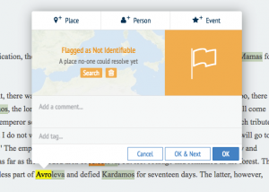
The second type of vague reference is when we don’t know where a specific city, feature, or monument is. In cases like these I have to utilize the flagging option (already mentioned above). At the moment there are 134 geographic references flagged. There are a couple reasons why there are geographies that need to be flagged. The first is that there are no tags in Recogito, nor are there any modern towns which have evolved from the Byzantine town, which I could tag.
However, sometimes the need to “flag” a reference is due to the name of a place being the same as somewhere much more important. For example: Avroleva is a town or possibly mountain somewhere in Bulgaria. I am not exactly sure where. The reason I know that much about Avroleva is because there is a glacial mountain range in Antartica which is named after Avroleva, Bulgaria. Searching for any information on Avroleva the town is quite difficult to near impossible because all of the results are about Avroleva the glacial range.
A final example of uncharitable geographies in the Chronicle is towns whose only documentation of existence is the Chronicle itself. Take for example “John of Kyrestai.” We do not know where Kyrestai is because that is the only mention of the place, and the mention does not even give us a general idea of where it could be.
These flagged towns will forever be a mystery.
Conclusions
These two posts on our use of Recogito are simply preliminary documentation of our process and ongoing questions. Over the course of this Summer 2018 we will be using Recogito to craft some carefully edited maps for portions of the Chronicle. These will take advantage of some of Recogito’s new tools for analysis, such as color-coding based on item “type.” Look for a blog post in August 2018 on the results of these efforts.


