
Text and data visualizations by Jesse W. Torgerson; data collection by Rachel Chung (’20) and Ezra Kohn (’20); mapping by Grant van Inwegen (’20) and Jesse Simmons (’21) with assistance from Kim Diver.
Please see our introductory post. The Traveler’s Lab at Wesleyan University has applied our movement-focused approach to medieval history to contextualizing New York City’s tragic status as the “epicenter”of the global COVID-19 pandemic.
“The COVID-19 pandemic has created a tidal wave of data.” The struggle for scientists and the public at large is not how to find this data but how to contextualize and understand it. A common answer is comparison, but comparison is methodologically tricky. Our use of comparison is informed by our lab’s engagement with the Practices of Comparing project at Bielefeld University (see Johannes Grave’s reflection on this “incomparable” pandemic).
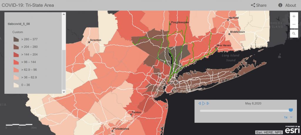
In this post we work steadily through a series of comparisons to draw a sobering conclusion. Even as New York City and the “Tri-State” region immediately surrounding it (denoted in the map below) have seen significant and steady declines in the day-by-day tallies of new COVID-19 positive tests and fatalities, the region’s levels of infection still remain at or above the peak levels found in the two countries most deeply hit by COVID-19: Italy and Spain. We conclude that it would be wise to take these comparisons into consideration as the states of New York, Connecticut, New Jersey, and Pennsylvania each consider imminent re-openings.
 Click for interactive map.
Our previous post on COVID-19 in the NYC Commuting Region focused on our creation of the map visualization linked above. We described how we chose to collect and analyze COVID-19 testing and confirmed fatality data from a region defined by patterns of travel and movement rather than political borders. Our comparative map presented relative infection rates in each county to neighboring counties, and between past and present.
Our second approach, analyzed here, identified a means of comparing our region as a whole to outbreaks of COVID-19 in other regions that might be considered similar. We identified the nearly-contemporary COVID-19 outbreaks in Italy and Spain as the best comparisons (or, comparata).
In what follows we first present visualizations of the data that is behind our map. We will then suggest how this data might become coherent and comprehensible by comparing it to the same data from Spain and Italy. Finally we note that differences in testing rates and methods for counting fatalities make all these data technically incommensurate. Nevertheless, historical comparisons are ultimately always associative rather than predicative: historians cannot ever achieve the perfect tertio comparationis demanded by Early Modern logicians. Nevertheless, comparisons serve the historical goal of providing us with context, desperately needed to make sense of a present that seems unprecedented.
Visualizing Testing and Fatality Data from the NYC Commuting Region
We should first define our region of study. Instead of conforming to political or natural geographic boundaries, we defined our region by human travel. Beginning with a map of freeways and rail lines, we identified a list of counties within an approximately 2-hour drive or train ride from New York City as the outer “commuting region” of the metropolis. Since the virus spreads through human movement and contact, rather than according to any other factor, this seemed to us the only reasonable means of defining a region in which to study the impact of a virus on a population. The list of counties this encompassed can be found below, in our footnotes. In total the region we have defined as the New York City Commuting Region consists of 33,929,534 residents within 28,893.3 mi2.
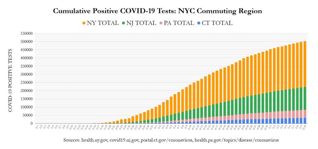
Our first visualization presents a cumulative tally by day of the total number of positive COVID-19 tests, colored by the state to which each county in our region belongs.
Click image for an interactive graph.
This visualization reveals apparently positive news. The use of stay-at-home and social-distancing measures to “flatten the curve” is working: the steep climb of the bars in the three weeks between April 4 and April 25 (from 150k to 400k) has notably slowed in the three weeks since (from 400k to 510k).
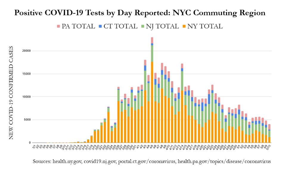
This same data rearranged to show only each day’s newly reported cases shows an even more encouraging trend:
 Click image for an interactive graph.
From a peak of nearly 23,000 new cases on the single day of April 5, on May 9 and May 10 our region saw two successive days with fewer than 5,000 new cases. Nevertheless, within this positive trend, comparing the number of cases between the New York and New Jersey counties indicates that the decrease is largely driven by the success of New York counties, while Connecticut, Pennsylvania, and especially New Jersey are still discovering relatively similar numbers of new cases each day. Update: from April 26, New Jersey’s counties have matched or surpassed those we are studying in New York in terms of confirmed daily new COVID-19 cases (see here). As a whole 1.6% of the region’s population has tested positive for COVID-19 (543k out of 33.9m).
In other words, this data would suggest that the success of New York City proper in limiting the spread of COVID-19 may be masking the fact that the region as a whole remains deeply infected. This conclusion is backed up by the more absolute numbers of COVID-19 attributed fatalities.
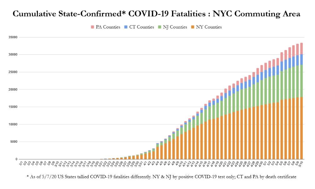 Click image for an interactive graph.
The counties in New York State have seen a dramatic decrease in what was for weeks a horrific number of new daily fatalities. Nevertheless, the number of daily fatalities reported by New Jersey continues at relatively a steady pace (see chart). If we consider our integrated region as a unit, the situation remains much more serious than when we imagine states as isolated from one another. As of May 10, 2020, the counties of our designated region have confirmed 33,442 COVID-19 fatalities. To contextualize where this places us in relation to other regions devastated by the virus, we turn to our comparisons with Italy and Spain.
Visualizing Comparisons between the NYC Commuting Region, Italy, and Spain
Without a comparative context it is impossible to understand what the numbers we have discussed mean. Even though we can identify a downward regional trend in terms of both new cases per day, and in terms of fatalities, where are we compared to other regions that have experienced a large portion of the population testing positive for COVID-19?
To try to answer that question we will compare the NYC commuting region (population 33.9m) to two others: Italy (60.4m) and Spain (46.9m).
These regions are most comparable for all having suffered dramatically from a staggering number of COVID-19 infections. They are significantly different in terms of land mass, population, and population density, and so all comparisons must be discussed with at least this caveat in mind (leaving aside all discussion of differences in health care systems, demographics, etc.).
The New York City commuting region we have focused on is both smaller and more densely populated than Italy, and especially more so than Spain. Our region has a total population of 33.9 million within 28,893 mi2, or 1,174 persons/mi2. Spain is far less densely populated with approximately 240 persons per each of its 195,363 mi2. Even the most densely populated region of these European countries—Northern Italy—only has 599 persons/mi2 (27.8 million persons within 46,430 mi2). .
Thus, the primary reason for comparing these regions is not their demographic comparability, but for the need to demonstrate just how devastatingly the COVID-19 virus has set into the population of the New York City region. COVID-19 has had a devastating impact on the two entire countries of Italy and Spain, both larger than our region in terms of population and land mass. Nevertheless, the absolute reported numbers of infections and fatalities from these countries pale in comparison to those from the much smaller region surrounding New York City.
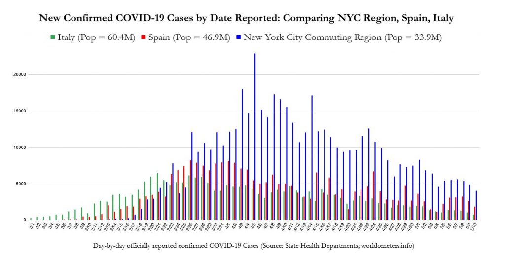 Click image for an interactive graph.
While the downward trend of new cases for the New York region is still evident, it is only in the previous week (since May 4) that the number of new daily cases has consistently dipped below the peak number of cases per day reported by Spain (which is, in turn, even higher than Italy’s peak). Italy and Spain have only seen peaks of daily new cases hovering around 5,000 or 8,000 per day, respectively. On the other hand our NYC region has seen many days of over 15,000 new cases per day, only consistently maintaining numbers below 8,000 since May 2. Our region’s numbers of new daily cases still remain beyond the levels of Italy’s peak. This is a staggering comparison when we consider that New York State is beginning to “reopen” on May 15.
These much larger numbers of new cases are certainly connected to the significantly larger number of COVID-19 fatalities that the New York City commuting region has suffered.
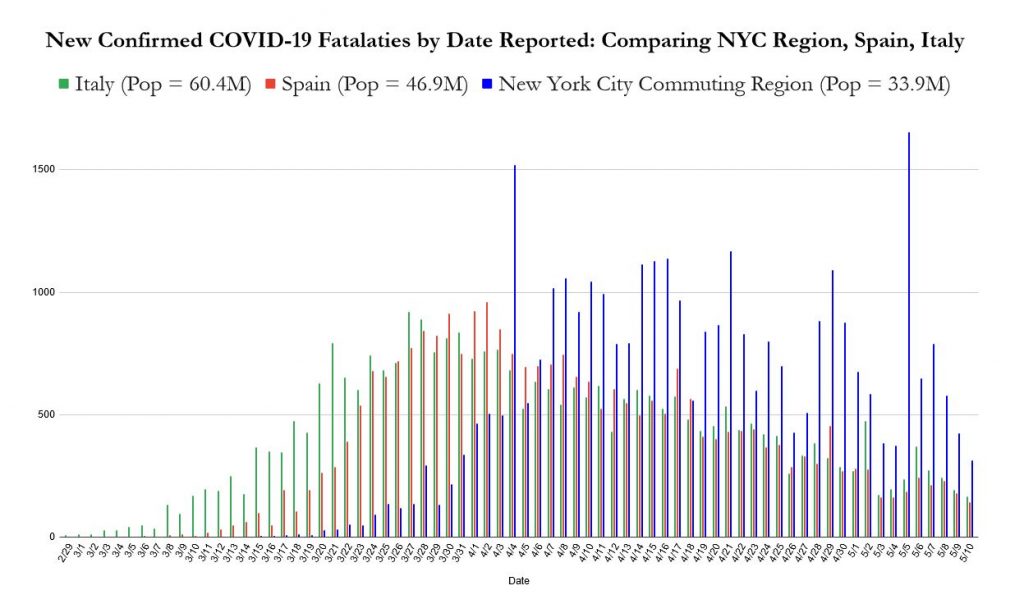 Click image for an interactive graph.
On ten different days, our region has seen over one thousand fatalities in a single day. Neither Italy nor Spain, with their much larger populations, ever experienced a single day with this level of devastation from COVID-19. The cumulative result is a staggering and sobering comparison.
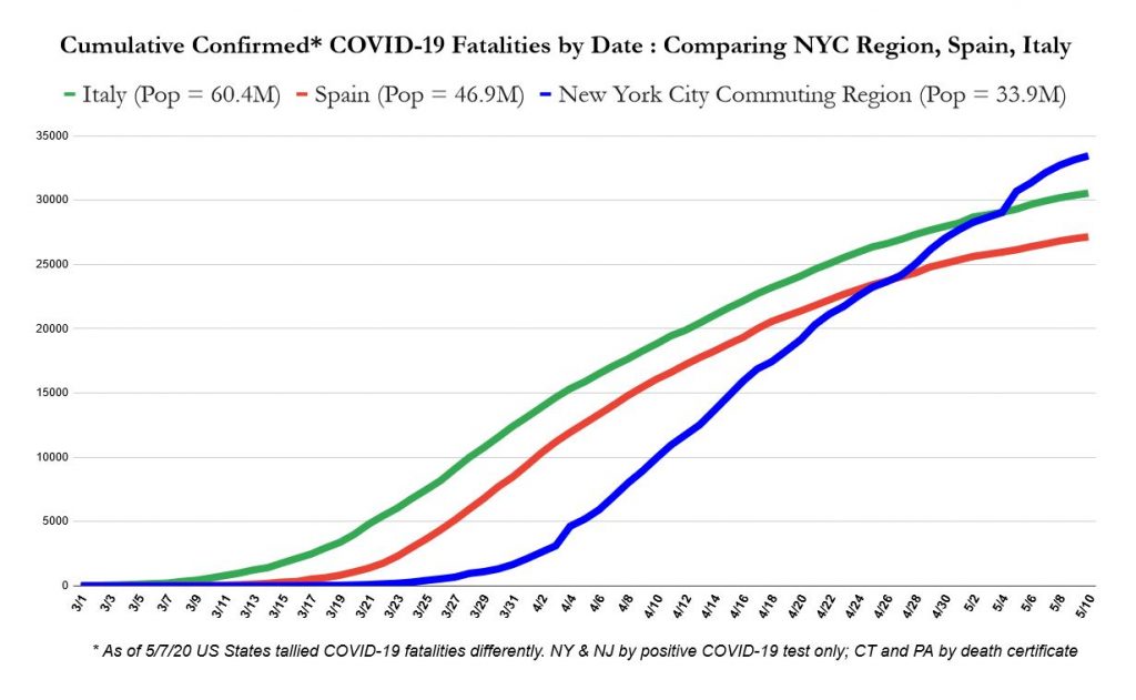 Click image for an interactive graph.
As time moves on, the New York City Region’s smaller geography, much more dense and interconnected population, the much deeper degree to which it has become infected, and its own looser social-distancing approach to “lockdown” will likely mean the spread of the virus through the population will likely continue to behave uniquely.
Even as reports have for weeks declared that New York State alone has more reported cases than any country (besides the United States itself), and that the wider New York City area is the current global epicenter of the spread of COVID-19, the scope of the spread of the disease in the region immediately surrounding New York City remains unrecognized and under-reported.
Reporting continues to fall along traditional state-by-state divisions, but as demonstrated in our map and the visualizations above the spread of COVID-19 through counties that can be considered within “commuting distance” of New York City (~2 hours) reveals quite clearly that tallying and reporting cases and fatalities according to state borders is an inhibition to understanding the true spread of this virus.
We have presented our studies not to strike fear, but to be an aid to productive action. We hope that better understanding of the data we have collected concerning the ongoing spread of COVID-19 will result in soberness and seriousness in addressing how to slow and stop the toll which COVID-19 has and will continue to wreak in our area. We urge our readers to action, and compassion.
Conclusions: the Problems with Comparison, and its Value
Positive tests seem to be perfectly commensurate: different countries use different tests, but these have not been reported to be significantly more or less effective in producing accurate results. On the other hand, the sums of positive tests are not comparable because Spain and Italy appear to have a postive test rate of approximately 8-12%, whereas the counties in our study have positive testing rates of anywhere from 23% to 45%. This means that the population of the NYC commuting region is still not being tested at a high enough rate to determine what comparing our total numbers of positive tests to either Italy or Spain demonstrates. If the states of New York, New Jersey, Connecticut, or Pennsylvania were administering enough tests to have only an 8-12% positive rate, how much higher would our total number of positive tests be than in those countries?
Conversely, comparing fatality rates seems to be initially problematic. Even within the four US states that we drew our data from, fatalities are reported differently. New York and New Jersey report COVID-19 fatalities only when the individual received a positive COVID-19 test prior to dying. Connecticut counts these situations as well as when the death certificate lists COVID-19, which can be a discretionary decision. Pennsylvania has seen its fatality counts swing down or up as it revisits its approach to reporting. The CDC continues to allow states discretion in making these decisions. Of course, the same problems apply to the recording of data from Italy and Spain. Nevertheless, it is all but certain that by any reasonable method of attributing fatalities to COVID-19, we are currently in no danger of overcounting the number of deaths this virus has brought.
This is supported by comparing our two sets of data to each other. Recent studies indicate that the “true” fatality rate of COVID-19 is around 1.3% (counting all those infected, including asymptomatic cases). If we consider the COVID-19 attributed fatality rate per positive COVID-19 test of the counties we have studied, we can get an idea of whether each county truly knows how deeply infected their own population is. For instance, in the Pennsylvania counties we have studied, a 2.2% fatality rate per positive test indicates that there are likely at least twice as many active cases as have been identified. On the other end of the spectrum, New Jersey’s 6.7% fatality rate indicates that there are likely five times as many active cases as have been recorded.
Comparison cannot give us an absolute or exact explanation of what is happening around us. Nevertheless, this is not the goal of comparison. Comparison gives us a relative idea of what we are experiencing, or what has happened. In this case, working through several comparisons seems to make it quite clear that the population of the New York City region is as yet much more deeply infected with COVID-19 than Italy, Spain, or any other comparably sized population in the world. Furthermore, our practice of comparison has also made it clear that even this sobering statement is not sober enough. Until we have a much lower percentage of positive to negative COVID-19 test results, we will not know how deeply the population surrounding New York City is infected. There is no perfect tool, but comparison can help us to understand how deeply the virus has established itself, and to formulate what that might mean for current behaviors, future planning, and not least of all to speak to our desire to contextualize what we are all experiencing: to mourn our losses, to commemorate those who have fallen, and to work together to save those we can.
Footnotes: Sources and Notes
Since March 24th we have collaboratively collected our data of county-by-county confirmed COVID-19 cases on a daily basis from the official updates provided by the Departments of Health of New York, New Jersey, Connecticut, and Pennsylvania. We periodically check for errors by back-checking our data against the data published by the New York Times, and by the crowd-sourced reporting of 1Point3Acres. Data for positive tests and fatalities for Italy and Spain were drawn from worldometers.info. Our data on the population and size of each US county was derived from the US Census data contained in the Esri feature layer “USA Counties.”
Notes on idiosyncrasies in the data.
From March 1-March 16 our map records the total number of cases in New York City, as reported by New York State, without making distinctions for the five counties (boroughs) within the City: Bronx, Kings (Brooklyn), New York (Manhattan), Queens, Richmond (Staten Island). For these dates, we noted all NYC fatalities and cases in New York County (Manhattan).
For March 17 to April 5 we used the data provided by New York City Health to distinguish the confirmed cases for each of the five New York City counties. This meant, however, that for this range of dates, we drew numbers for these five counties with a different time stamp than the published state data on the number of confirmed cases in NYC as a whole. We decided that the greater articulation achieved was more valuable than perfectly matching numbers.
From April 6 on, New York State began including distinct data for the five New York City counties (rather than grouping them all together as “New York City”), and we thus returned to using this state data for our tabulations rather than the New York City data.
For April 16 and April 17, New York State produced no fatality counts , except for a total number of fatalities from NYC for each of those days. In keeping with the practice noted above, we added these numbers to New York County (Manhattan). This results in wildly varying county-specific statistics for New York County from April 15 through April 18.
List of counties studied:
New York State: Bronx, Dutchess, Kings (Brooklyn), New York (Manhattan), Nassau, Orange, Putnam, Queens, Richmond (Staten Island), Rockland, Suffolk, Sullivan, Ulster, Westchester
New Jersey: All
Connecticut: All
Pennsylvania: Berks, Bucks, Carbon, Chester, Dauphin, Delaware, Lackawanna, Lancaster, Lebanon, Lehigh, Luzerne, Monroe, Montgomery, Northampton, Philadelphia, Pike, Schuylkill, Wayne